
The Era of Mobile-First Indexing
Were does mobile-first come from? – The mobile-first design started as smartphones made their way into our lives. Mobile phones had been connected to the Internet since 1996, but it was the modern smartphone that bridged the gap between people on the move and the Internet.
Smartphones opened the Internet to a whole new demographic, not to mention all the tech enthusiasts that were already in the game. The evolution of the mobile/cell phone started a revolution in how we communicate and operate.
In 2010 Google’s (then) CEO Eric Schmidt announced at the Mobile World Congress, that they were embracing the “Mobile-First” ethos. Predicting that smartphone sales would soon overtake PC, Google would focus on mobile software before computers.
Then, in 2011, Schmidt pushed it a little further by saying, “What I would suggest right here, right now at the Mobile World Congress. We understand that the new rule, is Mobile-First”.
We always keep our devices at our side, or at least close by. Our smartphones are a deeply integrated component of our modern lives, so naturally reaching your audience via their phone is the most efficient way to go. Mobile-First Indexing was inevitable.
What is Mobile-First?
Simply put, Mobile-First is a website or app constructed primarily for smartphones, which expands up into other larger devices, such as tablets, laptops and desktops. Over the years we went from mobile versions of a website to RWD (Responsive Web Design), making the content not only available to mobile users but to look good. However, over the last decade, it has become more than just an concept or mindset.
It’s not just about looking good on a smartphone, Mobile-First is about proper structure for mobile – visually, technically and interactivly. User experience, fast load time, intuitive interface, while meeting the optimum energy and data efficiency targets. And, let’s not forget the content must be of quality, relevance and consumable for the mobile user and desktop users alike.
Understanding Mobile-First Indexing – Best Practices
Mobile-First vs Desktop-First?
The title of Desktop-First came about as Mobile-First came along, previously desktops were the standard, since the first personal computer as that is all there really was. Making a website was primarily desktop then, as an afterthought, a mobile version, or a Mobile-Friendly version (RWD) breakdown for smartphones and on occasion other devices were implemented.
Can I Still Build Desktop First?
There are still many designers, developers and marketing agencies telling anyone who will listen that Mobile-Friendly and Mobile-First are the same. They are NOT. Or, that Desktop-First and Mobile-First is about your content and target audience, so therefore choose the appropriate path for your target audience. Wrong.
Let’s clear up all the confusion with some facts…
Mobile-Friendly is NOT the same as Mobile-First. Mobile-Friendly is/was a solution for Desktop-First sites to be presentable on mobile devices. Mobile-First is a Mobile-First site, as in thought, planned, structured, and designed for mobile. Then, if you choose (which I recommend), construct responsively, so the site can expand across devices.
Or in other words…
Mobile-Friendly is about making your desktop website appear presentable across all devices. Mobile-First, however, is not simply adding a few lines of code to be responsive. Mobile-First design is an approach that requires every element of your website to be created and optimised for mobile first, every other device is secondary.
If you want to build Desktop-First – for whatever reason – then of course you can, but do not expect anyone to see it because Google have completely switched to Mobile-Indexing. Simply put, desktop versions are now primarily ignored by the crawlers and desktop only sites will be dropping from the index altogether. If you currently have a desktop only site and you are still in the SERP, it will eventually drop off.
This doesn’t mean that desktop is irrelevant, it just means it’s no longer champion; Mobile-First is a new era of indexing. With over a decade in the making, I cannot see anything replacing Mobile-First for a long time. In the words of Eric Schmidt, “The new rule is Mobile-First”.
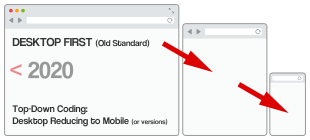
Top-Down Coding
Top-down coding or desktop first, puts a restriction on scale as it starts with the assumed largest screen size, power source and connection. As a top-down coded website is adjusts down various screen sizes it may look okay, however the power and data consumed has a much heavier impact on devices, draining batteries and inflating user data costs.
Bottom-Up Coding
Bottom-up coding or mobile-first on the other hand has more scalability as these websites are designed to expand. A massive difference with mobile-first is that the designer/developer of a website must think deeper and design better. As the priority is on mobile the impact of every element must be considered.
The aim is to create a beautiful and intuitive website using the least number of resources possible. Meaning trying to get away with lazy building, excessive ads and relying heavily on plugins for everything is no longer an option. Then to pass Core Web Vitals every carefully selected element on your website must be optimised.
Mobile-first raises the bar and demands fluid, clean, intuitive functional design. The users have a better experience, search engines have better quality websites to answer queries, our websites had a stronger, lighter and have a scalable solid foundation. The cherry on top is less carbon dioxide is emitted per page view due to the careful construction, clever design and functional efficiency.

The Journey to Mobile-First Indexing?
There was a theory in the 00’s that a new Internet was coming. This new Internet was going to start in 2010 and over the years it would clean out all the nonsense and banditry. 2010 came and went and the Internet was still progressing, but not enough to call it a new Internet. But in fact, the work had already begun. I like most, just never noticed.
Over the past decade Google has released many updates (claimed to be over 1000 per year), however the core updates that changed the fundamentals of the algorithm brought us to this point. Claiming a “new” Internet may be a stretch, but many of the issues that have been addressed, and now the index has changed.
A Brief Catch-Up:
Panda – February 2011
The purpose of Panda was to stop keyword stuffing, user generated spam and plagiarized duplicate or thin content. This was fairly mild when affecting ranking to begin with, but in 2016 Panda was added to Google’s Core Algorithm, which put the foot down. There was no warning when you got a Panda penalty, your sites ranking just fell through the pages into the abyss were no-one visits.
Penguin – April 2012
Having the most streamlined body on the planet, Penguin was the perfect name for this Core update. Google started to glide through the shady sites that got to the top using unnatural backlinks, such as PBNs and farmed links. Irrelevant and spammy links also killed a website’s authority as Penguin’s penalties came down on the website owners like Thor’s hammer.
Whether these sites got pulled in by ignorance, naivety, or banditry – millions of businesses got hit EXTREMELY hard as Google shed the nonsense from the SERP.
On the other side of the coin, Google received a lot of backlash for the severity in which this update hit businesses. Therefore, as we moved into Mobile-First Indexing and Core Web Vitals, Google gave us plenty of warning(s), rolled out slowly and kicked the can of completion a couple of times to let site owners get caught up.
Hummingbird – August 2013
This algorithm helps Google interpret search queries based on the user’s intent, rather than the exact user keywords. In fact, it may not even contain the keyword or phrase. Rather than reading a string, like a collective of characters that made up a name, Hummingbird created IDs for entities, once confirmation of an exact entity had been made, because there are no two entities the same. The natural language processing that makes this possible relies on latent semantic indexing, synonyms, and co-occurring terms. Once again, hitting the keyword stuffing sites and content lacking in quality.
Mobile – April 2015
This is where Mobile-First began to take effect. Poor usability harmed your ranking. Making it best practice for your website to be Mobile-Friendly, or responsive (RWD). Speed had already been a ranking factor for a long time, but great speed on a mobile takes more effort. Then, User-Friendly on the mobile version of a web page influenced rank even further. Your desktop was still important. However, this is where the focus shift started moving to mobile. Google were still to test Mobile-Indexing.
RankBrain – October 2015
I believe it fair to say that the machine learning system that is RankBrain was a complete revolution to search. Spring boarding off the Hummingbird algorithm, RankBrain could now add context to help narrow down and assign the correct entity ID faster, helping Google understand a search query by considering the larger context.
Rather than simply searching for words, RankBrain was searching for meaning to understand the user’s intention.
There are many aspects that RankBrain considers; such as implied words, personal search history, location, and even common entities. Presenting the best match for the user’s search. Websites with shallow or irrelevant content and/or poor UX stopped getting rewarded, along with those who were trying to “game the system”.
BERT – October 2019
Bidirectional Encoder Representations from Transformer. This update seemed to be a cherry on top. BERT’s natural language processing technology took Googles search query to a whole new level. Content that is irrelevant, lacking in context or just poorly written has nowhere to hide with BERT on the case -and will negatively affect the ranking. On the other hand, it is great news for fast, high performing websites with quality relevant content.
All these Core updates have been cleaning up the SERP and fine tuning the algorithm for relevant quality results. Then, after plenty of testing and slowly rolling out, Google completely switched to Mobile-First Indexing in March 2021, after moving the date from September 2020 to give website owners even more time to get caught up.
With all the fundamental changes to the Core algorithm, mind blowing AI, and introducing a completely new indexing system, a new standard of excellence and a new way to construct websites for end users, would you consider it a new Internet?
Conclusion
Whatever your thoughts on all the changes, it is crystal clear that if you want to be indexed properly in the new era of Mobile-Indexing your site must be Mobile-First. If you want to rank well, your site must be optimised for Mobile-First, Page Speed, and pass Google’s new Core Web Vitals.
Google have given over half a decade of warning, then an extra year on top of that and rolled out Core Web Vitals slowly with the recent Page Experience Update, there are really no excuses not to be up to date. Yet, many site owners still haven’t bothered. Which is great news for you!
Solution
If you have lost rank due to the changes or, you are one of the lucky few that has not been hit yet, Get in Touch Now and one of our performance specialists will help get your business back on track. Using our proprietary Mobile-First framework, we can rebuild your website Fully Optimised, Mobile-First with Ultra Performance and as a cherry on top Araneum Consultant built websites are also optimised for low carbon.
Your New Secret Weapon
If you’re looking for professional assistance to help get your site in tip-top condition and back on to the elusive first page of Google,
Get In Touch with Us Today –
That’s why we’re here!
Other Relevant Articles
- Core Web Vitals: A Brief Overview
- Making Money with Positive Change:
Low Carbon Web Design - Why Page Speed is Crucial
- The Era of Mobile-First Indexing
- Social Signals – An Essential and Modern Way to Conduct Business
- Search Engines Take SEO to A Whole New Level
- Marketing and Promoting Your Business Online
- Why You Need an Online Marketing Strategy Today
- Is Your Site Really Mobile-Friendly?
- Why You Should Never Undervalue the Importance of Branding
- Not All Hosting is Created Equal
- So, You’re Looking For a New Website?
